5 tips to make your images load much faster
Images must load fast if you want to keep your audience on your website or app. for a longer period of time. Learn 5 tips on how to boost images, leverage alternative image formats (WebP), and resize them properly right here!

Marketing statements like “47% of users expect a website to load in less than 2s” or “according to Amazon, every 100ms of additional page loading time results in 1% less revenue online” are not required to convince one that successful revenue-generating websites and mobile apps must be fast and responsive.
Across all devices and screen sizes.
In the jungle of websites and apps available to buy a couch or blue jeans, rent a flat, buy a car, read news about Trump’s last tweet, would you wait for a page to load for 5 seconds or bounce to the next result on Google?
Images and videos replace today the sales executives and messengers of yesterday.
They also consume a large part of the Internet traffic and are also what makes your website and app load slower.
Acceleration techniques like lazy loading and adaptive streaming (check out DASH and HLS) are well covered in the web dev community and definitely help improving performance.
However they will be of little value if the fundamental problem is not addressed:
Images must load fast if you want to keep your audience on your website or app.
In this article, I will share 5 tips to boost images, resulting in your page loading faster, your SEO improving and finally increasing your conversion rates and revenue.
First: resize images
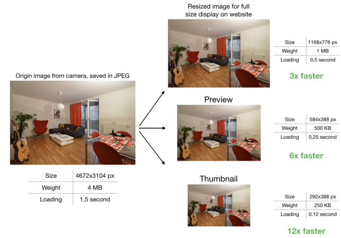
To improve page loading times, all image sizes (thumbnail, preview, full size image) must be generated server-side.
There is really no point in serving one large 4672x3104px (14,5 MP) image weighting 4MB to your user’s web browser / app and let her generate the thumbnails locally on her client.
I know it might sound cumbersome to generate 3 sizes of the same image (and many more if you take into account smartphones and tablets) but this is the first step towards faster loading pages.

Don’t worry, there are tools to resize your images automatically to multiple formats, I will talk about them in another article.
Takeaway 1: generate all image sizes server-side and deliver the right image size at the right moment of your customer’s journey.
Second: compress images
When resizing and saving an image, it can be further compressed using the JPEG compression method.
I will go through details of JPEG in a separate article, all you need to know for now is: JPEG downgrades the quality of an image for the benefit of lighter weight (in MB).
As it is not possible to recover the origin quality from the downgraded images, it is referred to as a lossy compression method.
JPEG does a great job at it, and you can reduce the weight in KB/MB of an image by 3 or 4 times without noticing the loss in quality.
To make it super simple: the JPEG compression factor q can be set to a value between 0 and 100 when saving the image in your favourite Photoshop-like software.
100 does not compress additionally, 0 destroys your image but makes it very light 😅. Typically values between 50 and 100 are used, sometimes even less, we will talk about optimising the compression factor in a separate article.
For now, let’s say you can use q = 85as default value to compress your images even more without visible quality loss.
(image compression specialists, please do not trash me for this statement, this is meant to be an intro to image compression and acceleration methods)
Takeaway 2: leverage JPEG compression to reduce the size in MB of your image. q=85 is a good default value to optimise images without visible quality loss.
Third: leverage alternative image formats (WebP)
According to Google, who develops and maintains this image format:
"WebP is a modern image format that provides superior lossless and lossy compression for images on the web. Using WebP, webmasters and web developers can create smaller, richer images that make the web faster and increase conversion rates.
WebP lossless images are 26% smaller in size compared to PNGs. WebP lossy images are 25–34% smaller than comparable JPEG images at equivalent SSIM quality index."
Yes, you read well, you can save some additional Kilobytes by leveraging WebP. The only caveat is that it is only supported by following browsers and rendering engines:
- Google Chrome (desktop) 17+
- Google Chrome for Android version 25+
- Opera 11.10+
- Native web browser, Android 4.0+ (ICS)
Chrome market share being about 55% as of January 2018 (according to statcounter), you can be sure to hit at least 1 out of 2 users with faster WebP images. I will explain how to leverage WebP in another article.
Takeaway 3: deliver WebP to compatible browsers, otherwise JPG/PNG.
Forth: cache and deliver fast images via CDN
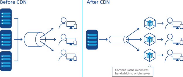
Now that you have generated all required image formats, compressed them and leveraged WebP, the last piece of the puzzle is to deliver them rocket fast to your users. This is where Content Delivery Networks, or CDNs, come into play.

A Content Delivery Network will cache all versions of your images in edge servers (called Nodes or Points of Presence, PoPs) located as close as possible to your end users. This has 3 main benefits:
- users located far from the data center where your website or app is hosted will experience much lower latency and load images faster
- the CDN will absorb high load (during traffic peaks) and will save you $$$ in hosting infrastructure
- it will “protect” your servers by absorbing Denial of Service-like attacks
Long story short, a CDN will deliver images fast around the world, reduce the number of servers you need to host your website/app and protect your from attacks.
There are many CDN vendors out there, and we wrote a whole article to help you choose the best image CDN for you.
Takeaway 4: deliver images rocket fast to your users via CDN.
Fifth: make images responsive
Before you can consider your image optimisation efforts to be done, you have to consider one last thing: responsive images.
A 15" laptop has a different screen size than a 4" smartphone and also requires different image sizes. Delivering an image prepared for a 15" screen on a 4" smartphone is like shooting a mosquito with a bazooka.
Especially when you consider that smartphones are usually connected to cellular networks, which are (in general) slower that the broadband connections laptops are connected to.

Hence, image sizes for various screen sizes must be created to serve all form factors in an optimal way.
Responsive images will allow your website or mobile app to load faster across various screen sizes by adapting the image size delivered to the end user to her screen size.
The HTML <picture> element with the underlying <source> elements allows to specify which image size will be delivered to which screen size.
Sample HTML without responsive design:
<img src=”//sample.li/flat.jpg" />The same image but responsive:
<picture>
    <source media=”(max-width:576px)” srcset=”//sample.li/flat_1_1x.jpg 1x,
//sample.li/flat_1_2x.jpg 2x, //sample.li/flat_1_3x.jpg 3x”>
    <source media=”(max-width:768px)” srcset=”//sample.li/flat_2_1x.jpg 1x,
//sample.li/flat_2_2x.jpg 2x, //sample.li/flat_2_3x.jpg 3x”>
    <source media=”(max-width:992px)” srcset=”//sample.li/flat_3_1x.jpg 1x,
//sample.li/flat_3_2x.jpg 2x, //sample.li/flat_3_3x.jpg 3x”>
    <source media=”(max-width:1200px)” srcset=”//sample.li/flat_4_1x.jpg 1x,
//sample.li/flat_4_2x.jpg 2x, //sample.li/flat_4_3x.jpg 3x”>
    <source media=”(max-width:1920px)” srcset=”//sample.li/flat_5_1x.jpg 1x,
//sample.li/flat_5_2x.jpg 2x, //sample.li/flat_5_3x.jpg 3x”>
</picture>
In this example, I am considering the following 5 screen sizes:
- smartphone in portrait mode (576px)
- smartphone in landscape mode (768px)
- tablet in landscape mode (992px)
- laptop (1200px)
- LCD screen (1920px)
You can also notice that I am taking into account higher pixel density screens like Apple Retina.
All in all, I need in this example 15 versions of my origin image to deploy proper responsive design.
And I definitely need to write more code. (yes you guessed it, there are tools to do this for you 😃).
Takeaway 5: leverage the HTML5 <picture> element to deliver the right image size to the right screen size and have responsive images.

Conclusion: handling images is challenging but not impossible
Pfiouuu, this article got longer than I expected, but I think I covered the main points to help you start with accelerating your images.
I will dedicate a full article to every tip described above and show how the solution I co-founded, Cloudimage.io, can help you automate image resizing and provide an image CDN.
Cloudimage resizes more than 100 Million origin images monthly and delivers over 4 Billion images over its image CDN. So we know what we are talking about (or at least think we know 😅).
Subscribe to our Newsletter and get image optimization updates and techniques straight to your inbox.
With Love from StationF in Paris 💙.
PS in case you scrolled straight to end of the article, I am summing up the 5 key takeaways below:
Takeaway 1: generate all image sizes server-side and deliver the right image size at the right moment of your customer’s journey.
Takeaway 2: leverage JPEG compression to reduce the size in MB of your image.
Takeaway 3: deliver WebP to compatible browsers, otherwise JPG/PNG.
Takeaway 4: deliver images rocket fast to your users via CDN.
Takeaway 5: leverage the HTML5 <picture> element to deliver the right image size to the right screen size and have responsive images.
Say goodbye to your in-house solutions and come accelerate your websites with Cloudimage today!


