


Image Optimization for Mobile Devices Quick Wins
With over 6.648 billion smartphone users in the world today, making up about 83% of the world’s population, there’s no doubt that mobile devices are here to stay. Mobile devices are not going anywhere, nor are the images they display. But how can you ensure those images look their best when viewed on a tiny screen?
The answer is simple: image optimization for mobile devices!
Why is there a need to serve optimized images on mobile devices?
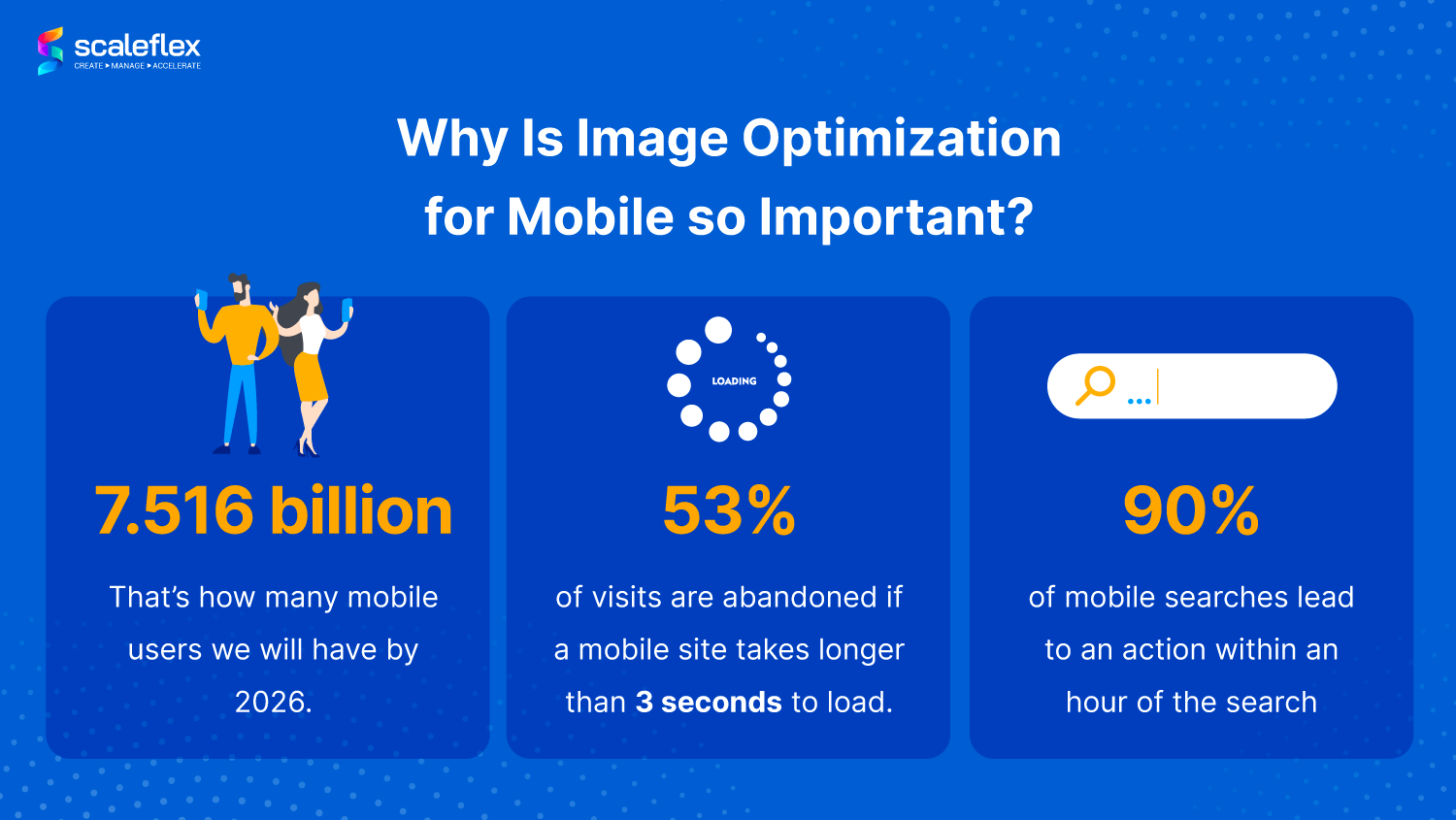
Mobile experiences and interactions are the future of search, and by 2026, the number of mobile users will grow to 7.516 billion. Since increasingly more people are using their mobile devices to search, browse, and shop than ever before, businesses will need to make mobile speed optimization a priority to avoid missing out on millions of potential customers.
Attractive and high-quality visuals for mobile sites can lead to a slow site speed as images take up the most weight on any website. Consumers don’t want to wait for images to load or for pages to scroll. In fact, 53% of visits are abandoned when mobile sites take more than 3 seconds to load.
That’s why how fast an image load affects mobile web performance, and it is so important to use optimized images for mobile devices.
What is image optimization for mobile?
But what do “optimization” and “optimized” even mean? Image optimization means that the image has been compressed in such a way that it takes up less space on your page and is thus easier for your visitors’ devices to load quickly. Not only is optimization about image compression, but ensuring that it still looks amazing and flawless on your mobile sites.
The goal? Mobile-optimized high-quality images with the lowest file size!
Images impact the performance of your website
Optimizing your images for mobile devices is important because the smaller the image, the faster your page loads, which means more people can see it and click through to your site. Image and mobile optimization also helps you avoid having to sacrifice great-looking images for fast loading times. Especially for e-commerce transiting to m-commerce, getting these steps right can do so much to improve your shopping cart conversions!
Return to the Table of ContentsHow to measure the performance of your mobile images?
To measure your mobile speed performance, you can use the following tools:
- Google PageSpeed Insights: A free Google tool to measure your web performance on both mobile and desktop.
- Cloudimage Website Performance Report: A free tool that analyzes your website’s page content loading speed and presents how Cloudimage media optimization solution can help improve it.
- Google search console mobile-friendly test: Even though it doesn’t provide much information on mobile performance, it provides valuable information on whether your page is mobile-friendly.
How to optimize images for mobile?
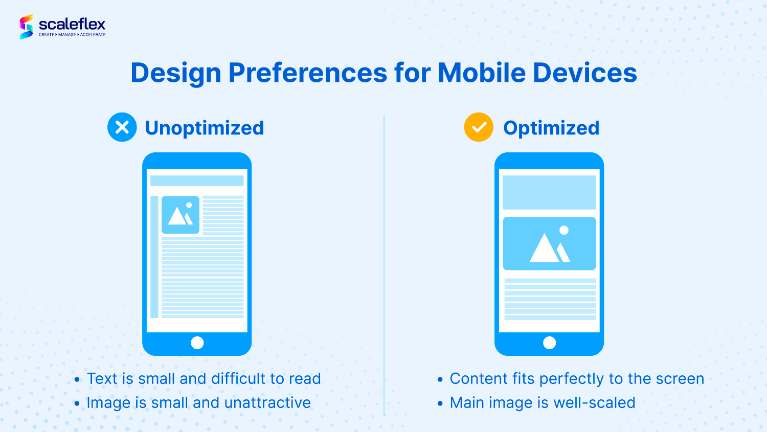
Is optimizing images for mobile and desktops different? Definitely! Mobile devices have smaller screen sizes, and when content is too small to read, it decreases the user’s experience.
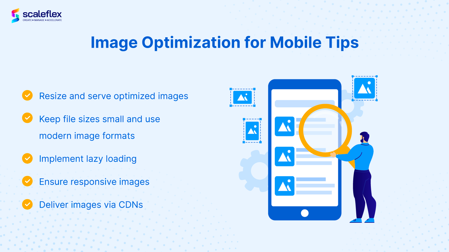
Resize and serve images that are optimized for mobile
Images on mobile need to be of the right size!
Too big, and it will slow down your website and make it challenging for people to load them quickly. Too small and it will make it harder for people with small screens (like mobile phones) to actually see what’s going on in your photographs and visuals.
Resizing can be done manually via photo editing tools like photoshop, but since businesses use so many images daily, an automatic resizing software can really help improve productivity and reduce time-to-market.
Keep file sizes small and use modern image formats
After resizing, image compression is essential. File sizes need to be small - less than 50kb if possible. This ensures they’ll load quickly, even on slower networks or older phones with less bandwidth.
Image optimization for mobile formats also plays a part in compression. Modern image formats like WebP (25% smaller) and AVIF (50% savings) help significantly reduce the image's size without losing its quality.
Implement lazy loading
Lazy loading defers the loading of images and significant elements that are not currently required on the mobile. What's great is that instead of loading all the images at one go, your users get to see your mobile site faster before fully loading the rest of the images.
To implement lazy loading, developers can use the (src) loading property on an "img" element to instruct the browser to hold off loading images that are not shown on the screen till the user scrolls down.
Ensure that your images are responsive
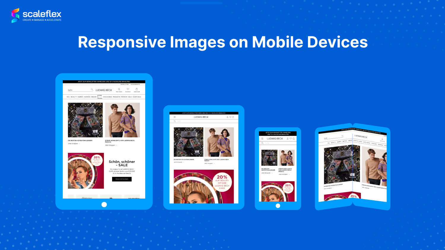
With so many different dimensions and screens out there today, delivering the best image size and dimensions across devices is impossible without relying on manual resizing and compression. Responsive images then help your website load faster on different mobile devices by adapting the size delivered depending on the screen size.
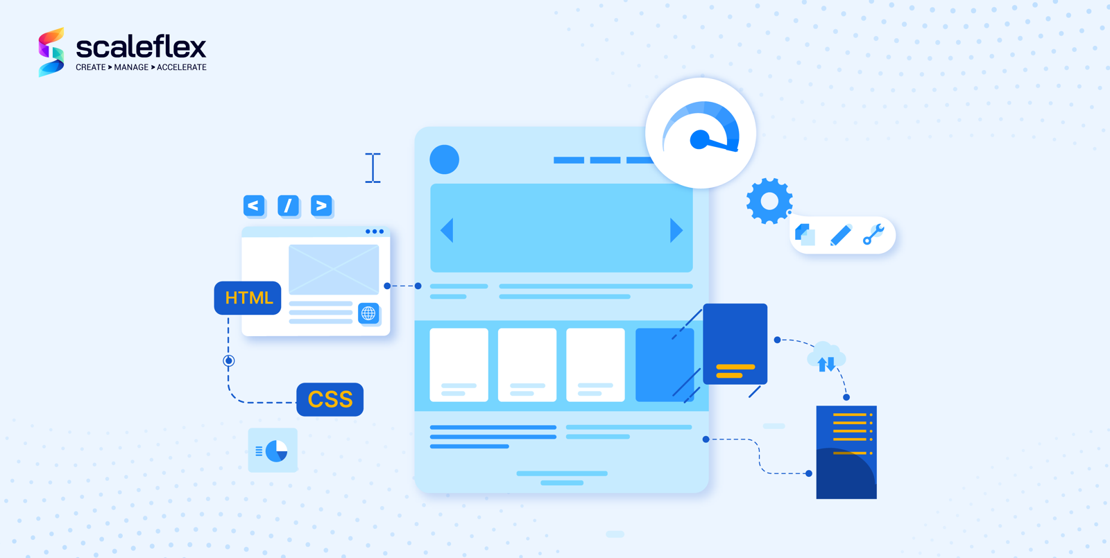
You can do so using the HTML
Deliver your images over Content Delivery Networks
Finally, Content Delivery Networks (CDNs) help to cache every single version of your images in Points-of-Presence (PoPs) located as close as possible to your end users. CDNs can help you save 40 - 80% of your image file size!
Mobile CDNs, which are specially made to handle the specific issues that may arise on mobile devices and optimize the content delivery of every wireless and mobile network, can also be extremely helpful for mobile image optimization.
Key Takeaways
Even though it may seem like many steps are involved in optimizing images for mobile, businesses can actually automate it with media optimization tools like Cloudimage.
Cloudimage is an image CDN that helps businesses save precious time and resources to implement all the different steps in image optimization for mobile viewing. Create image variants on-the-fly with just a simple change of parameters; no code is needed.
Registering for an account is FREE, and it comes with unlimited image transformations, 25 GB of image cache, and CDN traffic every month. Want faster mobile sites and automated image optimization for mobile? Try it out today.


