


Mobile Page Speed Optimization: How To Increase Your Performance On Mobile
Did you know that mobile accounts for roughly half of all web traffic globally? According to Statista, in the last quarter of 2021, mobile devices (tablets excluded) generated nearly 55% of all website traffic. In other words, mobile definitely matters… and so does mobile page speed. Even if your website is neatly optimized for desktop, if its mobile performance lags, you won’t deliver a first-rate user experience.
Why is mobile page speed optimization that important? How to improve mobile site speed and speed up your mobile app? Let’s answer these questions (and some more) in the following article.
Why Does Mobile Page Speed Matter?
The most obvious reason is that mobile traffic has taken a large piece of the online traffic cake. Regardless of your niche, the chance that your targeted audience is searching for your content on a smartphone is considerably big. Even though Google often changes its search algorithms and requirements, if your website and content are not optimized for mobile and your pages load slowly, your traffic will suffer greatly. To rephrase, if you want a successful site, you should be looking into ways to optimize your mobile website speed.
There were even times when an approach called “mobile-first” took the wheel of User Experience (UX).
The “Mobile First” Agenda
The “mobile-first” approach was officially introduced in 2010 by Eric Schmidt (the CEO of Google) during the Mobile World Congress. This is when he said that web designers should follow the “mobile-first” rule in product design. The term’s meaning is quite forthright. It literally means starting the product design process from the mobile end, which has more restrictions and then expanding its features for a tablet and/or a desktop version.
Shortly after that announcement, Google said it would start prioritizing mobile-optimized sites in its search results. Of course, nothing can set the course as effectively as the risk of dropping out of relevant Google search results. Expectedly, UX design teams started concentrating on mobile devices.
But where do we stand on the mobile-first theme in 2022? Is that rule still relevant? With the emergence of various screen sizes, this approach is not as concrete as it used to be, as we have entered an “omnichannel” era. Nowadays, online users tend to visit websites on multiple devices, switching between them to complete various tasks. However, the abundance of screen sizes and devices doesn’t mean optimizing for mobile is not important. On the contrary, it just means that we have much more work to do, and more factors to consider. It is safe to say that the “mobile-first” approach has now been changed to “mobile-friendly”.
Mobile Page Speed Optimization: From Past To Present
Optimizing for mobile is a subject that has picked the brains of many web designers and developers through the years. Today, responsive web design is often the quickest way to conquer mobile friendliness and fast loading speed, but there have been other means to this end, too.
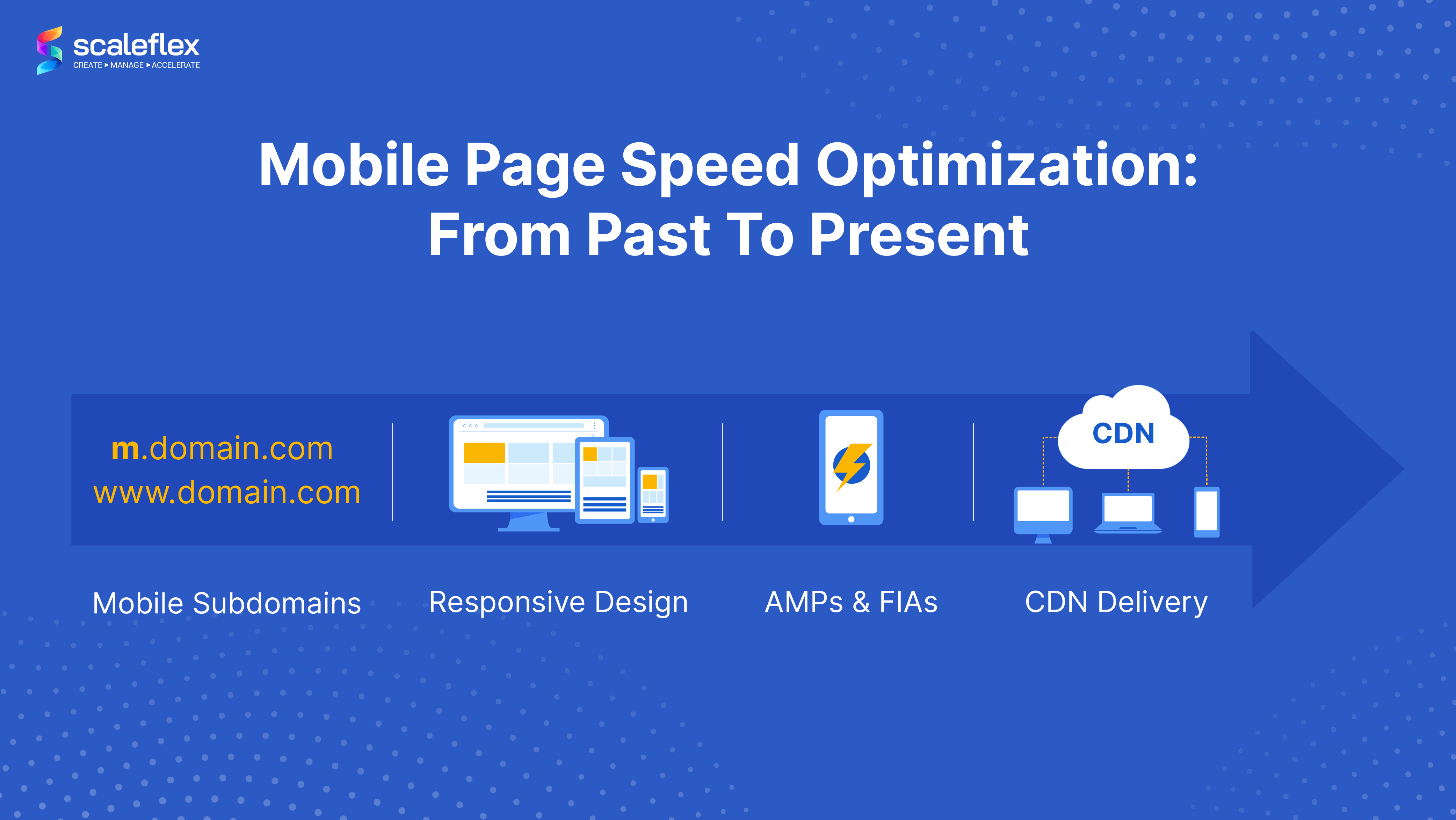
Mobile Subdomains
One of the promises of having a mobile subdomain was excellent site speed, as the mobile version would have been built via HTML and CSS specifically for the case. Subdomains also brought promises for better conversions due to the fast page speed loading. However, disadvantages appeared that slowly killed the hype, including risks of duplicate content (if rel=’canonical’ and rel=’alternate’ tags were misplaced), redirects between mobile and desktop killing the load speed, and the cost of having to build two separate codebases.
Responsive Websites
The term “responsive design” emerged in 2010, thanks to Ethan Marcotte, and more than a decade later, it is still here and still relevant (perhaps more than ever). This approach aims to make web pages render well on various devices and screen sizes, ensuring excellent user experiences. In other words, having a responsive website means that it will perform smoothly on smartphones, too. It is curious to mention that the mobile-first approach is a related concept that predates responsive design.
AMP (Accelerated Mobile Pages)
AMP was first introduced in 2015 and began appearing in Google mobile search results in February 2016. The technology stands for an open-source HTML framework developed by the AMP Open Source Project. Simply said, AMP works by diminishing pages to show their most crucial parts and storing a cached version on Google servers, thus improving the content delivery on mobile. It is noteworthy that AMP was originally created by Google as a competitor to Facebook Instant Articles (FIAs) and Apple News. However, the AMP approach has been widely criticized for empowering Google’s monopoly over the web. In terms of its adoption and usage, it seems that AMP has lost its momentum. Some even say that its future is uncertain, partly because Google has been placing more importance on Page Experience as a ranking factor.
CDN Delivery
A CDN is a geographically distributed network of proxy servers and their data centers. Its purpose is to improve content delivery performance and quality, and as such, it will be helpful for achieving great mobile speed, too.
CDNs cache web content, such as pages, images, and videos, in proxy servers that are close to your users’ physical locations. The caching process that CDNs provide helps consumers reach online content without delay on various device types, including mobile.
We should also mention the availability of a service called Mobile CDN, which aims to optimize content delivery on any type of wireless or mobile network. It is indeed similar to a traditional CDN but specifically equipped to deal with the unique characteristics of mobile devices, meaning that it will not only save bandwidth but also load faster. A mobile CDN also fits the needs of mobile applications.
Benchmarks for Mobile Site Speed
How fast should a mobile site load? What is a good mobile website speed?
It is safe to assume that consumers’ expectations regarding site speed, in general, are on the rise. However, with a predominant number of people using mobile devices, expectations for mobile site speed maybe even higher (despite being more challenging to meet).
Have you heard that a webpage should take up to 2 seconds to load? This has been the unified benchmark since 2015. As Google’s John Mueller has said, it’s the limit that most online users would wait for a page to load. That’s the general rule. According to another analysis of 5 million desktop and mobile pages, the average loading time for a desktop page is 10.3 seconds, whereas the average loading time of a mobile page is 27.3 seconds. This means that the average page takes approximately 80% longer to load on mobile than on desktop. However, ‘average’ doesn’t necessarily mean good. Even with mobile networks not “fast” enough, it’s best to aim at loading a page in less than 3 seconds, or as per Google’s recommendations, less than 1 or 2.
Note. Perhaps you are wondering why page loading speed is slower on mobile devices. The answer is simple - desktop computers are equipped with better processors. Furthermore, computers generally have better internet connection in comparison with mobile carriers. This is pretty much the reason why loading takes longer on mobile vs. desktop devices, even when the site is mobile-optimized.
How to Optimize the Mobile Website Speed?
What are the steps you should consider to conquer the mobile page speed optimization task? The Think With Google project has some good recommendations, which you can follow.
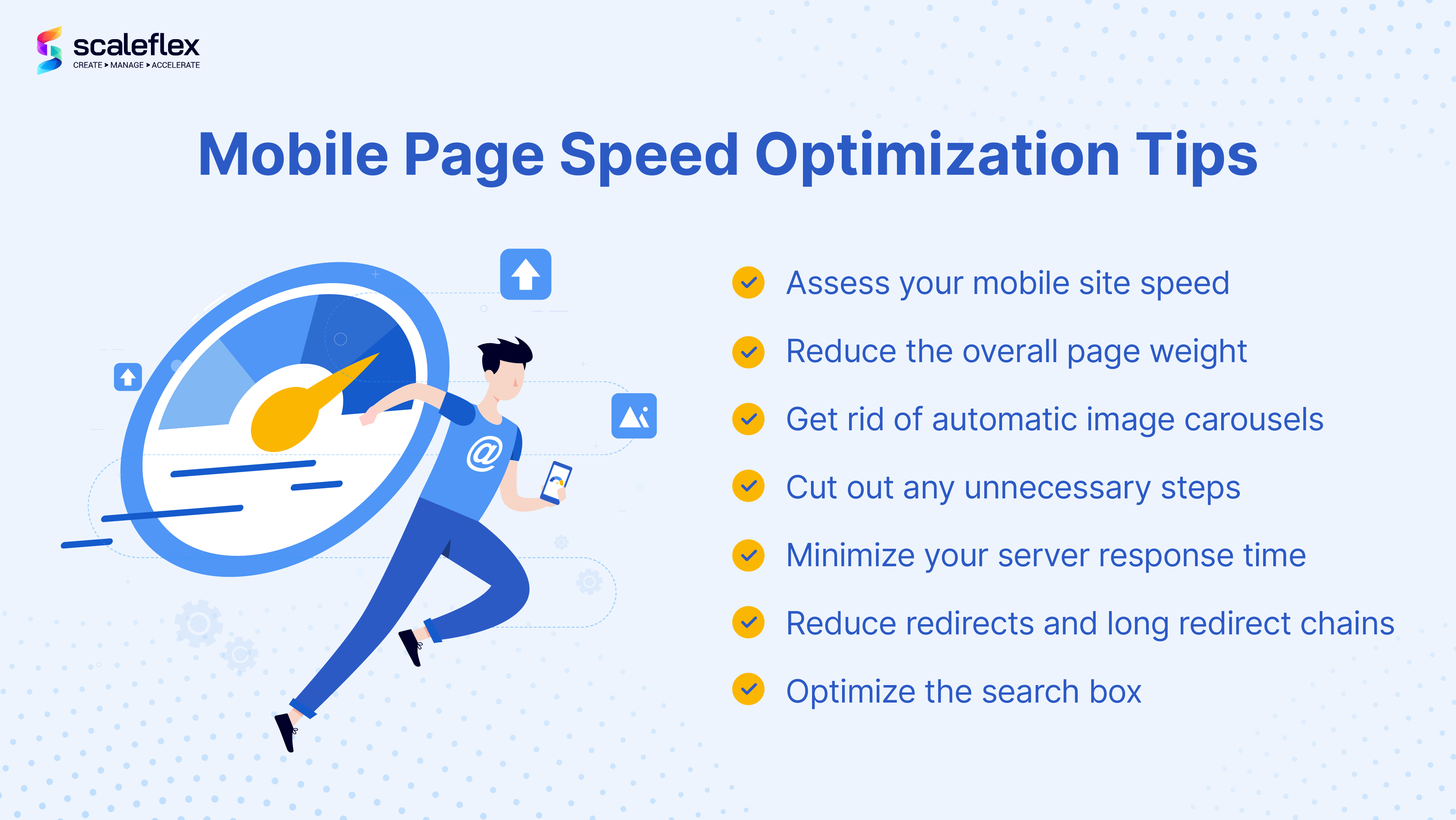
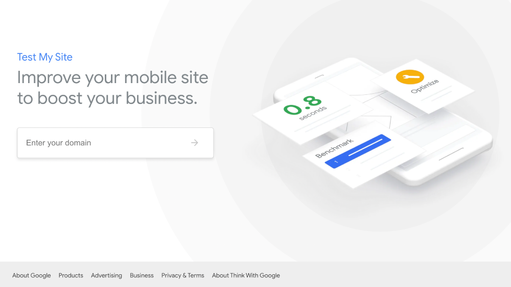
- The first step requires assessing your mobile site speed. To do that, you can use the Test My Site service, which is a free tool designed to evaluate the mobile performance of a site. It will also provide custom solutions to improve your site speed.
- Reduce the overall page weight a.k.a. page size of your site, so that it is less than 1,000KB. Page size refers to the overall size of a particular web page, including all of the files used to create the page, such as HTML documents, any included images, scripts, and other media.
- Get rid of automatic image carousels, which would also improve the page weight. Keep in mind that your visitors are most likely only seeing the first image in a carousel, anyway.
- Optimize the search box on your mobile site by putting it above the fold.
- Cut out any unnecessary steps your visitors need to take, such as simplifying the check-out process.
- Minimize your server response time. Google’s recommendation on server response time is 200 milliseconds. If your mobile site doesn’t meet this number, you can try improving your server software and configuration.
- Reduce redirects and long redirect chains, because they tend to reduce the page load speed, especially on mobile devices.
Conclusion
A fast, well-optimized mobile site will increase your website traffic, generate more potential leads from your site, and improve your conversions. Even though desktop performance is still crucial, mobile represents the current (and most certainly future) consumer needs. An intriguing estimation is that in 2022, as little as 100ms of additional page loading time will decrease conversion and revenue by 10%. Why risk it? Make your mobile site as “fast and furious” as possible.
Bonus tip. For a smooth and effortless media optimization and acceleration, we would recommend using a service such as Cloudimage, which offers image optimization and CDN in one. Cloudimage will also help you with accelerating any media assets and static files on all types of devices, mobile inclusive.
FAQs
What is mobile website optimization?
Mobile website optimization refers to the process of adjusting your site content to meet the needs of visitors that access it from mobile devices. Optimized content is viewed flawlessly on both desktop and mobile devices.
How can I optimize my website speed for mobile?
If you want to optimize your website speed for mobile, you should first assess its current speed by using a specific tool, such as Test My Site. The tool will also provide suggestions and recommendations. The article above provides further instructions on what steps to take.
Why is page speed slower on mobile?
Desktop computers have better processors than mobile devices, and generally have a better internet connection when compared to mobile carriers. That is why loading takes longer on mobile devices, even when the site is mobile-optimized.
What is a good mobile page speed?
There isn’t a specific number. According to one analysis of 5 million desktop and mobile pages, the average load time of a mobile page is 27.3 seconds. However, average doesn’t account for quality, so always aim at improving your mobile page speed score.
Why is mobile speed optimization important?
Mobile site speed optimization ensures great user experiences, improves your site SEO and helps to accomplish better conversions. Go to “Why Does Mobile Page Speed Matter?” section to learn more.
Return to the Table of Contents


