


How to accelerate images on AMP pages
In the US, there are 30 billion mobile moments daily. People are empowered by their mobile devices every day - they want to make the right choices, no matter big or small and turn to their mobile phones to learn something, discover something, do something, watch something, or buy something. This consumer behaviour, termed by Google as micro-moments has reiterated the importance of a mobile-first approach!
Developed back in 2016, AMP’s goal is to accelerate mobile page, creating better and faster experiences on the mobile web. But in 2022, is AMP still relevant?
What is AMP?
Accelerated Mobile Pages (AMP in short) is an open-source framework created by Google in collaboration with Twitter. The AMP project seeks to “build the future of the web together” by creating fast, elegant, and high-performing mobile web pages across different distribution channels.
With the help of thousands of developers and publishers, more than 1.5 billion AMP pages have been created till date and this format is supported by more than 100 prominent ad tech, analytics, and CMS suppliers.
At its core, the framework allows you to build lightweight experiences for mobile by simplifying the HTML and following streamlined CSS rules.
With AMP, you’ll achieve improved performance and engagement: Pages built using the AMP open-source project load almost instantaneously, providing a smoother, more engaging customer experience.
One important thing about AMP is that it comes with a lot of changes in the structure of the HTML and general changes in how the JavaScript should be executed.
By design - those should be very light pages, without too many dynamic scripts and redundant elements.
How to detect AMP pages in Search results?
You’ve most likely clicked on an AMP before without even realizing it. The only thing you might have noticed is how the pages load instantly right after you’ve clicked it.
Previously, AMP pages were identified in the Google search results with a lightning icon next to the URL.
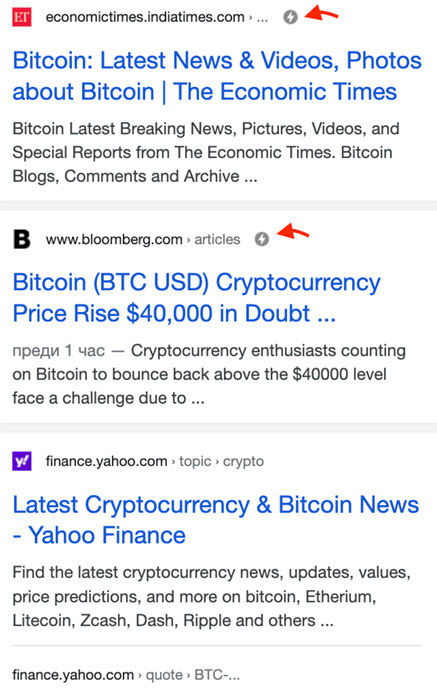
However, in 2021, Google quietly dropped the icon. Now, you won’t be able to visually tell the difference between an AMP and a non-AMP page in Google’s SERP. Google’s documentation states that it applies the same standard to all pages when ranking in SERP, regardless of the technology used to build the page.
Does that mean that AMP is dead?
While AMP is not directly a search engine ranking factor, AMP does speed up pages on mobile, and we know that Google loves fast-loading pages. It is worth noting that when you click onto an AMP page from Google search results, you’ll get snappy pages as Google caches, optimizes and validates AMP pages in its AMP cache. This is similar to what we know as a Content Delivery Network (CDN) for AMP pages.
For news and media businesses, AMP pages are also great for creating visual stories on the web. Web stories help content publishers build a mobile-focused format to deliver visually-rich news and information.
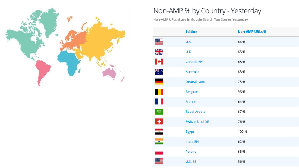
According to Newzdash’s AMP tracker (as of 17 May 2022), there are 64% non-AMP URLs on Google Top stories in the US, showing that AMP pages still account for a third of the pages in Top Stories.
How to speed up AMP pages?
On the web, every second matters. 40% of users will abandon a website when it takes over 3 seconds to load and pages with load times between 0 - 2 seconds score the highest E-Commerce conversion rates.
Then the next question comes: If AMP already helps deliver fast pages to a user out-of-the-box, is there a further need for AMP pages speed optimization?
AMP pages load quickly when clicked via Google Search - but they don't perform as well when these AMP documents are served from the origin servers. An optimized AMP page is critical, especially when the page itself holds other media assets such as images.
Importance of optimizing images in AMP pages
Like non-AMP pages, images are essential as they improve a website's user experience. Since 90% of all content we perceive and get transmitted to our brains is visual, images help attract and retain your visitor's attention.
On the other hand, visuals are also associated with large images that slow down the load times of websites. According to HTTP archive, images typically contribute to almost 75% of a website's total page weight. If users abandon the page before it fully loads, these images will come to nought.
Therefore, image optimization is still vital to accelerate AMP pages, and to achieve the initial goal of AMP pages - a beautiful and fast-loading site.
In the next section, we introduce you to Cloudimage, Scaleflex’s image optimization solution and how it can help you automate the optimization of images on your AMP website.
How to implement Cloudimage in AMP
Cloudimage can be implemented in various ways to make AMP pages faster: via the core API, the Cloudimage Responsive Images Plugin plugin, or different CMS plugins.
Implementing Cloudimage on AMP requires the use of the core API:
<amp-img alt="A beautiful boat"  src="https://demo.cloudimg.io/v7/sample.li/boat.jpg?
width=264&height=195"
width="264"
height="195">
</amp-img>
As amp-img relies on JavaScript, if the user chooses to disable JavaScript, images will not display. In this case, you should provide a fallback to the image using noscript tag:
<amp-img alt="A beautiful boat"  src="https://demo.cloudimg.io/v7/sample.li/boat.jpg?width=264&height=195"
         width="264"
         height="195">
    <noscript>
        <img src="https://demo.cloudimg.io/v7/sample.li/boat.jpg?width=264&height=195" width="264" height="195" />
    </noscript>
</amp-img>
But what if you want to use responsive images?
AMP makes it easy to implement responsive elements (for example image containers) in your page using the responsive layout as shown below (some cool demos on how AMP layouts work here):
<amp-img alt="Sunset in Paris" src="https://demo.cloudimg.io/v7/sample.li/paris.jpg?width=900&height=600" width="900" height="600" layout="responsive"> </amp-img>
In the example above, the image's container will be responsive and adapt to various screen sizes, however the image will still be with a fixed width and height of 900px x 600px and will look bad on larger screens or retina displays.
Modern higher end smartphones have device-pixel ratios of 2 or even 3, meaning that you need to deliver an image with twice or 3 times the resolution than on a desktop screen to have your users experience the same image quality.
Considering that AMP is mainly designed to improve user experience on mobile with lighter pages via faster-loading code, non-optimized images defeat its main purpose...
The solution: leverage srcset !
Good news! AMP supports the well known HTML srcset attribute. Combining srscet and Cloudimage-transformed images can help accelerate AMP pages as you will be able to deliver the right image size to any screen size and device-pixel ratio.
In the following example, we have several image files that are of the same aspect ratio but of different resolutions.
By supplying image resolutions, the browser can choose the image that best suits the device's resolution. Additionally, we have specified the size to render the image at:
- For a viewport width up to 400px, render the image at 100% of the viewport width.
- For a viewport width up to 900px, render the image at 75% of the viewport width.
- For everything above 900px, render the image at 600 px wide.
<amp-img
  alt="Nice Car"
  src="https://demo.cloudimg.io/v7/sample.li/tesla.jpg?width=900&height=600"
         height="600"
         width="900"    			    srcset="https://demo.cloudimg.io/v7/sample.li/tesla.jpg?width=900 900w,  https://demo.cloudimg.io/v7/sample.li/tesla.jpg?width=800 800w,       https://demo.cloudimg.io/v7/sample.li/tesla.jpg?width=700 700w,       https://demo.cloudimg.io/v7/sample.li/tesla.jpg?width=600 600w,       https://demo.cloudimg.io/v7/sample.li/tesla.jpg?width=500 500w,       https://demo.cloudimg.io/v7/sample.li/tesla.jpg?width=400 400w"
  sizes="(max-width: 400px) 100vw,
         (max-width: 900px) 75vw, 600px">
</amp-img>
Let's say we have a device that has a viewport width of 412px.
Based on the code above, the image must be displayed at 75% of the viewport width, so the browser chooses an image close to 803 px, which happens to be https://demo.cloudimg.io/v7/sample.li/tesla.jpg?width=800.
Validating AMP pages
It is always a good idea to test your HTML before releasing it. There can be various validators for AMP technology, but for sure it is highly recommended to use the official one from Google available here.
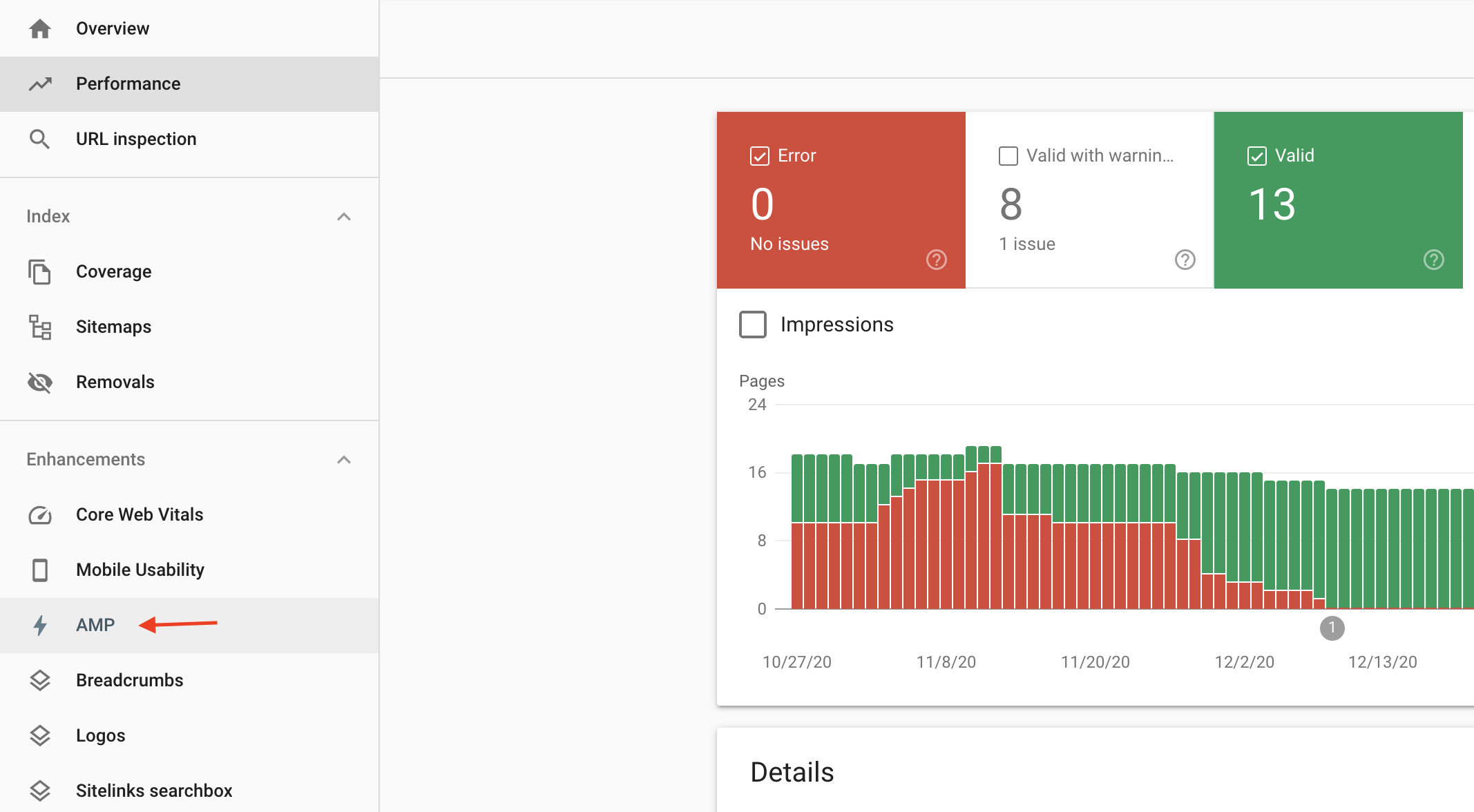
You can also refer to some reports for Accelerated Mobile Pages in Google Search Console.
Conclusion
With its robust framework, AMP can help speed up your website. The capability to load your site pages quickly can help you attract more users, and in turn increases conversions. When Cloudimage is used to optimize your images on these AMP pages, you’ll get an even faster and aesthetically-pleasing website.


