

A simple guide to responsive images
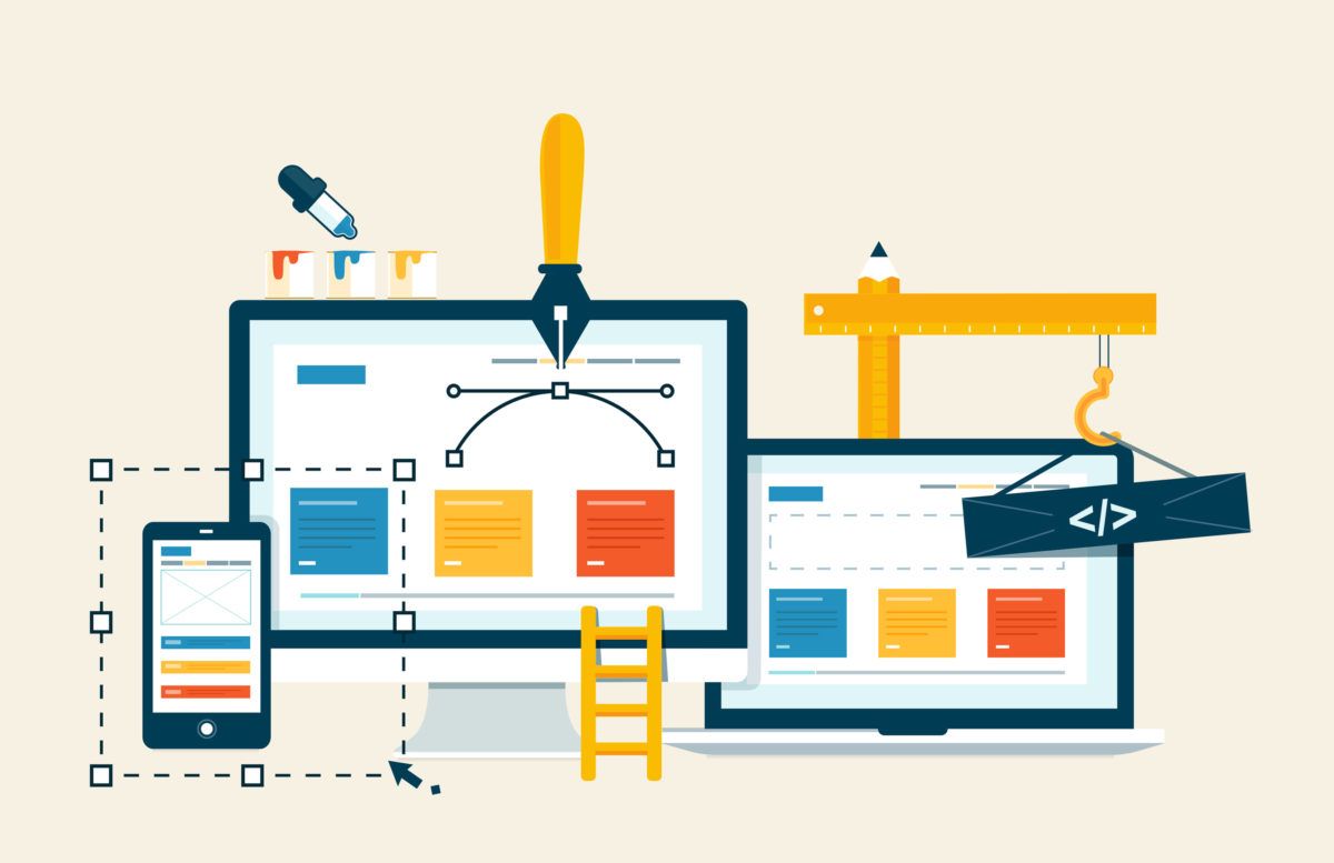
As a concept, responsive web design is aimed at providing the optimal viewing experience for users, all while cutting down on bandwidth and page loading time. Learn how to make your images responsive in a fast and easy way.
In previous posts, I talked about how to accelerate your images by resizing them, leveraging JPEG compression, and delivering WeBP to compatible browsers.
Today I will show you how to automate responsive images that automatically adapt to the end user’s screen size, orientation, and resolution.
As a concept, responsive web design is aimed at providing the optimal viewing experience for users, all while cutting down on bandwidth and page loading time.
By default, images are resized by the end user’s browser to match the device’s viewport dimensions.
This means that sometimes, you will have to send a larger image than what is actually required, and the user has to download more data than he or she needs to.
As you can see, it makes no sense to deliver an image prepared for a 15-inch laptop screen on a low-resolution, four-inch phone screen.
We want high-resolution screens to get larger, higher-resolution images, and low-resolution screens to get smaller, lower-resolution images.
Luckily, there’s a super simple way to conquer this issue: using a responsive JavaScript plugin.
Don’t believe me? Check what responsive images actually do here.
In this post I will demonstrate how to create responsive images using Cloudimage’s automatic JS solution.
Step 1: include the Cloudimage JS library
Include the Cloudimage JS library in your HTML pages, after all your content in body, before other scripts.
<script src=”https://scaleflex-global.airstore.io/cloudimg/responsive/cloudimage.plugin.min.js"/></script>
Step 2: initialize jScaler with your token information and optional parameters
document.addEventListener(‘DOMContentLoaded’, function() {
    jScaler.process({
		TOKEN: ‘[your token]’, // required
		BASE_URL: ‘[your image folder on server]’, // optional | e.g. “https://gallery.airstore.io/"
		DEFAULT_PARAMS: ‘none’, // optional | default parameters e.g.‘q70’ —
		reduce quality to 70%
    });
});
Step 3: Replace your img tags
Replace your img tags from src=”[image source]” to ci-src=”[image source]”
<img ci-src=”birds.jpg”>This also works for background, simply add the link to image as ci-background attribute:
<div class=”background-styles” ci-background=”birds.jpg”></div>The Cloudimage JS plugin will replace the ci-src attribute within the <img> tags with the right image size based on the user’s screen size.
That’s it! Check out the demo as well as some optional parameters here.
A deep-dive technical tutorial is available in our post below:
 Dmitry Stremous
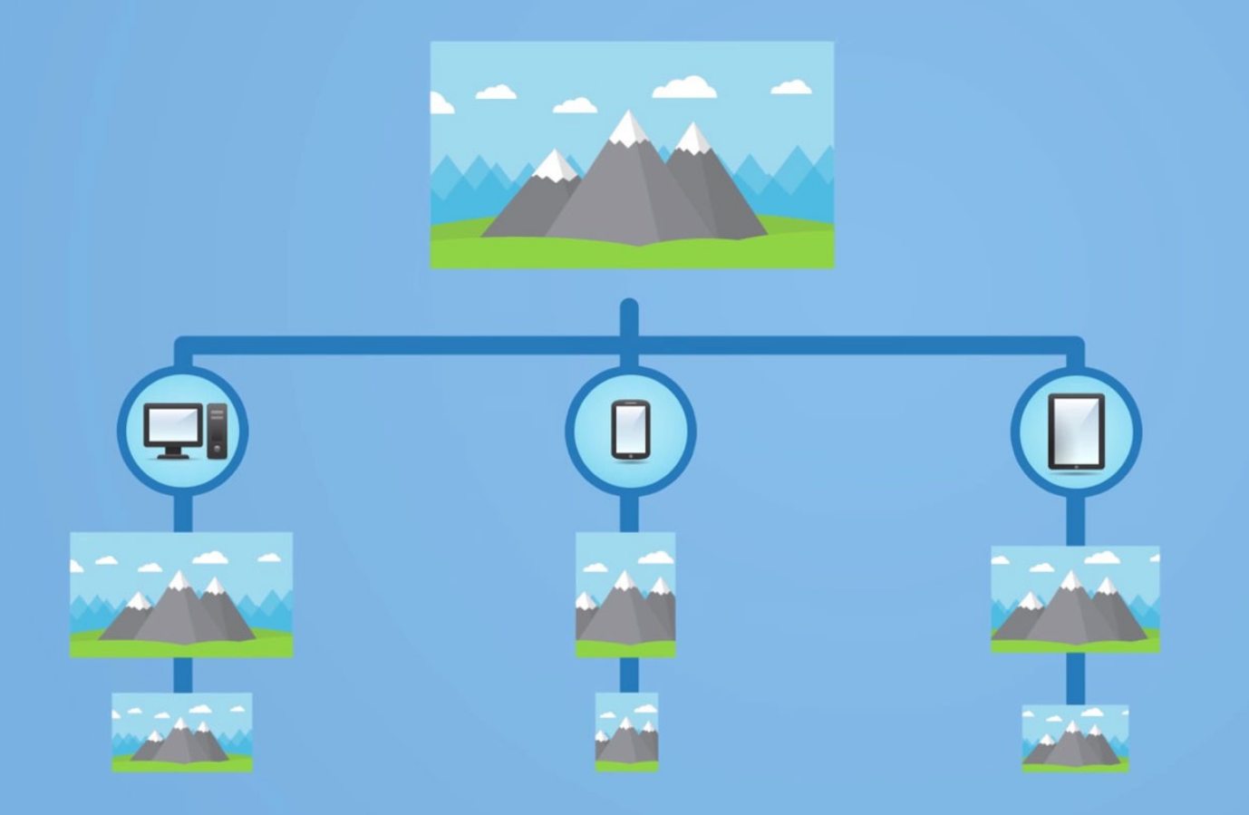
PS Make sure to subscribe to our newsletter below for monthly updates, news and case studies sent straight to your inbox! Be the first to know!


