

Responsive Images in 2020, Now Easier Than Ever
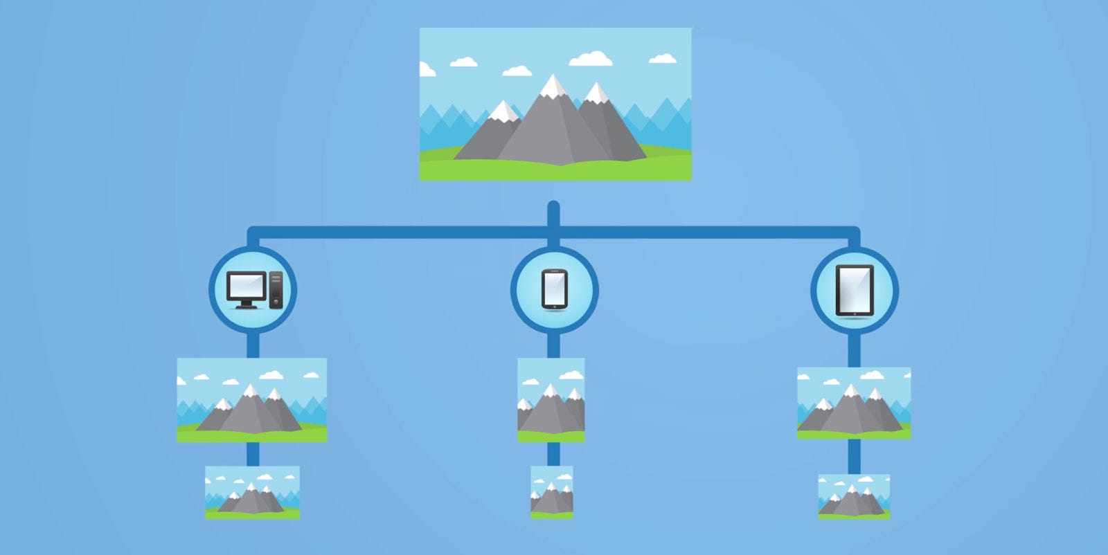
Is it possible to make your existing images responsive without creating new images? YES! Learn how to effectively optimize your images to respond to different devices and screen sizes with the speed of light!
Is it possible to make your existing images responsive without creating new images?
Can we upload one high quality original image and forget about the resizing and optimizing for all devices?
What about following the recent best practices like showing images with some fancy animation only when entering the viewport and still using simple <img/> tag with only one image source?
The purpose of this article is to answer these questions.
The problem is...
Images account for the largest part of a page loading time (44%). Large, unoptimized images dramatically slow down your site.
Following modern trends, ideally you would:
- Resize large images to the size needed by your design and generate multiple images for different device screen size
- Strip all unnecessary metadata and optimize JPEG and PNG compression
- Efficiently lazy load images to speed up initial page load and save bandwidth
- Use the “blur-up” technique or a ”traced placeholder” SVG or low quality image to show a preview of the image while it loads
- Hold the image position so your page doesn’t jump while images load
Doing this consistently across a site requires a lot of boring labor effort. And to change an image, even just to trim 50px from the top, you will need to regenerate and optimize new images.
People often forget that time is money. People usually do things manually because it’s easy and requires almost no research.
It’s manageable to adjust 10 images on your landing page. But if you have to manage 30,000 photos and videos from five different platforms, you need a good digital asset management software.
In 2019, optimized and responsive images should be easy and the standard.
The solution
In order to simplify things we will divide the solution into two parts: Front-end and Back-end.
Back-end part
Image optimization should be automated. Most CDNs and third-party solutions like Cloudimage offer comprehensive automated image optimization solutions.
The amount of time you’ll spend reading blog posts, libs and managing edge case (try to resize animated GIFs or deal with the PNG alpha channel) is worth more than the monthly fee for a service (Cloudimage has a free plan).
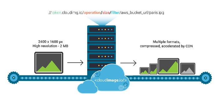
When an image is first loaded on your website or mobile app, Cloudimage’s resizing servers will download your origin image from your origin server, resize it and deliver to your user via lightning-fast Content Delivery Networks (CDNs).
Once the image is resized in the format of your choice, Cloudimage will send it to a Content Delivery Network, which will in turn deliver it rocket fast to your visitors, responsively across various screen sizes.
Read the following article to learn more about Cloudimage service.
Front-end part
Using the Cloudimage service we don’t need to create new images as we generate multiple images for different screen sizes and pixel ratio densities.
For example, if your origin image is available at:
generating multiple image sizes is as easy as pre-fixing your origin image URL with:
https://demo.cloudimg.io/width/350/s/sample.jpg/flat.jpg
What we need now is to figure out how we can deliver images with the optimal size. First, let’s see the types of responsive images:
- Images that stretch across visitor’s browser window
- Images that stretch across a fluid container
- Images that have a fixed width and height
- Images that have different proportions at different breakpoints of a screen width
All existing solutions on the web are based on the width of your visitor’s browser viewport. But, these are not ideal as they require a lot of calculations.
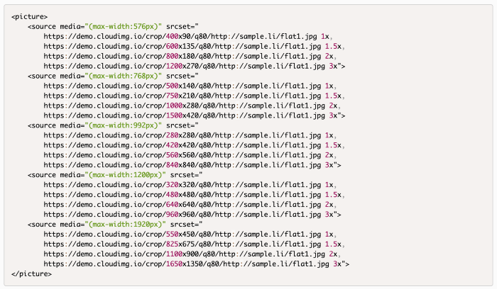
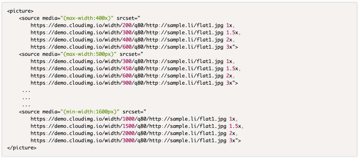
For example, if we want to make a fully responsive image we will come up with something like this for adaptive (with breakpoints) and responsive (fluid design) layouts:
In the abstract, I had the question “Can we simply use the <img/> tag with only the image source and make our image fully responsive?” The answer is: YES, with some JS help.
But how can we determine the right size for our images?
By detecting the width of the image’s container.
Detecting container width doesn’t cost anything in performance compared to downloading the incorrect image size. In addition, we can check screen pixel ratio density.
Let’s see the example.
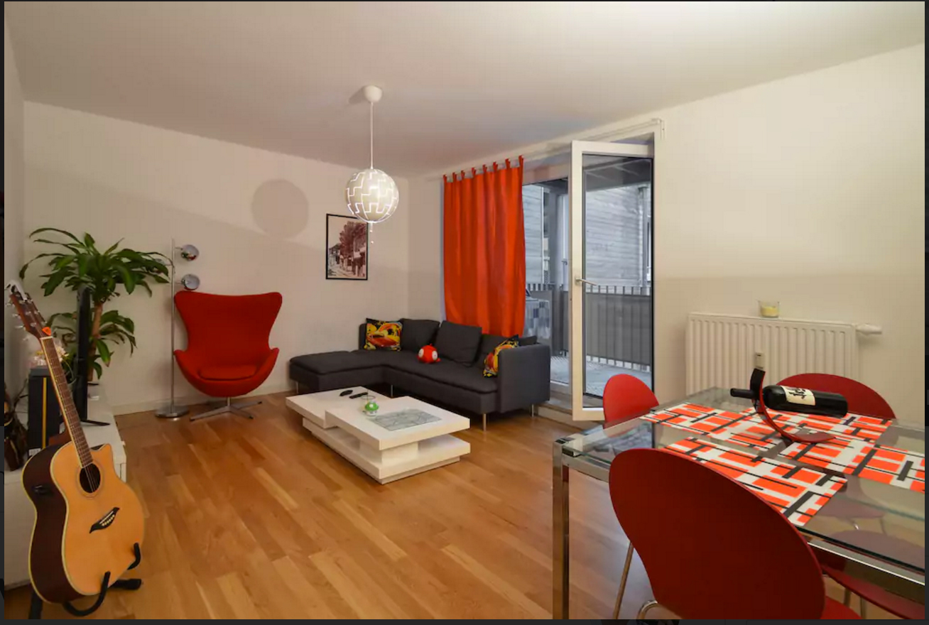
We have original image | 5.8 mb
https://cloudimage.public.airstore.io/demo/alain.jpg
Let’s apply what we have learnt and first detect the width of the image’s container and device pixel ratio.
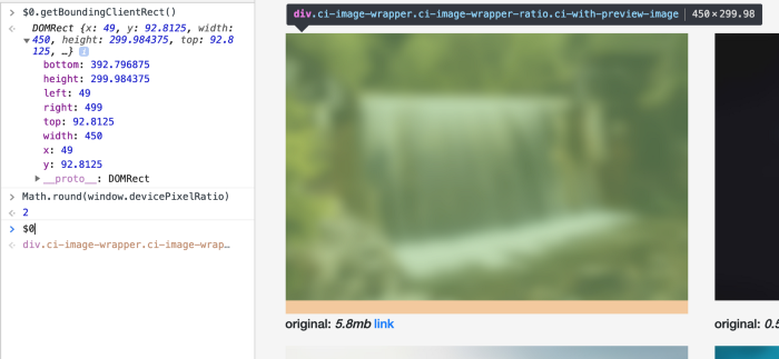
- Image container width is 450px (can be found with getBoundingClientRect)
- Device pixel ratio is 2 (can be found with devicePixelRatio)
Let’s round container width to next possible value which can be divided by 100 without the remainder => 500px. It’s done for cache reasons so that not all images are cached by 1px, but only 100px, 200px, 300px …
The resulting link will be the following | 119 kb
https://demo.cloudimg.io/width/1000/q35.foil1/https://cloudimage.public.airstore.io/demo/alain.jpg
The remaining part will be the same as the majority of lazy load image solutions.
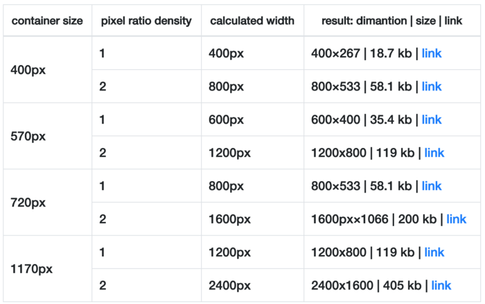
In numbers
We have the original image stored via CDN with 6240×4160 px resolution and 8.7 mb size:
https://scaleflex.airstore.io/demo/redcharlie.jpg
In the table below we can see which size and resolution will be loaded depending on the size of the image's container.
Implement in seconds
Imagine you had a simple library that support all these features and can be implemented in minutes?
This is what we have developed and made open source on Github: JS, React and Angular.
The plugins have some useful configurations, which allow you to change the quality of compression, disable lazy load, and hide animation on image load.
Also, you can apply some filters or transformations like cropping images differently depending on the screen width.
Conclusion
Responsive images may feel overwhelming at first, but with the Cloudimage and an image responsive plugin you can automate almost all repetitive tasks.
I would greatly appreciate any feedback and if you like the article and plugins do subscribe to our newsletter. It’ll motivate me to write about cool new stuff.
PS Make sure to subscribe to our newsletter below for monthly updates, news and case studies sent straight to your inbox! Be the first to know!


