


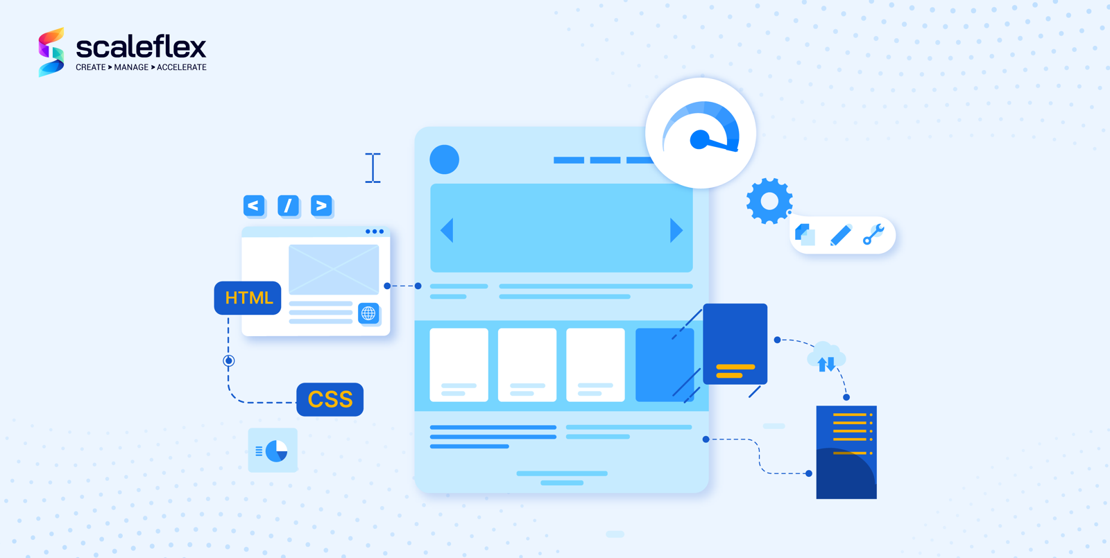
Responsive Images: Fundamentals And Implementation Methods
Responsive design is pivotal to a successful website. In this article, we will pay close attention to responsive images, in particular, including their technical aspects and implementation. By definition, a responsive image is an image with a size that responds well, or adjusts, to screen resolution changes. In other words, responsive images work smoothly on various devices with different sizes and resolutions.
So, what is there to know about responsive design and images? Let’s dig deeper together.
Origin of Responsiveness
The concept of responsiveness has existed for a long time but it wasn’t before the mid-2000s when it became a real thing. This was only logical as more users (consumers) switched to using mobile devices. As designers needed to discover ways to make their sites look equally well on desktop, smartphone, and tablet, flexible layouts started sneaking in.
The term “responsive design” emerged in 2010, thanks to Ethan Marcotte who is known as “the one that started that responsive design thing”. This is when he published a very famous article in which he explained the “flexible foundation” of responsive design. His article has been quite celebrated among professionals, as it exhibits how designers can use the flexibility of web to design websites for desktop, mobile and tablet.
But what exactly is a responsive web design (RWD)? It is a development approach for creating dynamic changes to a website appearance, according to the screen size and orientation of the device. It should also be noted that responsive design is based on an HTML structure which is linked to CSS (Cascading Style Sheets).
What is essential to RWD is the implementation of breakpoints needed to determine the way a site layout appears. One design is applied above a breakpoint and another one – below it. These so-called breakpoints are usually based on the width of the browser display. To summarize, RWD has many advantages and can eliminate the need of developing separate sites for various devices. Furthermore, the implementation of a single codebase improves both the development process and the maintenance that follows.
What Is A Responsive Image?
An image with a size that responds well to screen resolution changes.
Responsive images represent a small chunk of the responsive design process, aiming to adapt a site to work optimally within various environmental constraints, including:
- Display dimensions
- Quality of the display, such as pixel density and colour capability
- Connectivity and network conditions
- Input types, such as touch, mouse, and keyboard
Responsive images can be positioned in the website content, header, or background, a.k.a. responsive background image, responsive header image, etc. As we already said, this type of image adjusts well to different screen types and sizes. In terms of usability, consider the following abilities:
- It should be capable of rendering at different device pixel ratios, meaning that high-resolution screens display such images, whereas low-resolution screen doesn’t need to handle extra pixels;
- If a layout is responsive, or fluid, it should stretch or squeeze to “coordinate” with the changes;
- In both scenarios, images should be available in multiple resolutions to scale appropriately.
If you go for the pixel-based method, you can use multiple versions of the same image with various resolutions, choosing the best one to render based on the screen’s resolution. This method is more appropriate for devices that don’t render high-res images.
If you choose the fluid method, it will allow you to insert the image into a responsive layout, enabling it to stretch or squeeze when needed.
There’s also the so-called art direction method, which can be perceived as one of the problems when handling various screen sizes. This is “fixed” by modifying image content, cropping it down, or utilizing a different one according to the screen size.
What about the type-switching method? This comes in handy when browsers don’t support modern image types, such as WebP. Thanks to this “trick,” you can switch between various image types based on the content and the browser compatibility.
How to Test Responsiveness?
How can you know whether an image or a site responds well on various devices?
The most basic test you can perform is minimizing (resizing) your browser window to check its responsiveness, which is similar to viewing a page on various devices. However, keep in mind that this is only a good starting point in figuring out some bugs. You need a thorough check to be sure that everything happens smoothly.
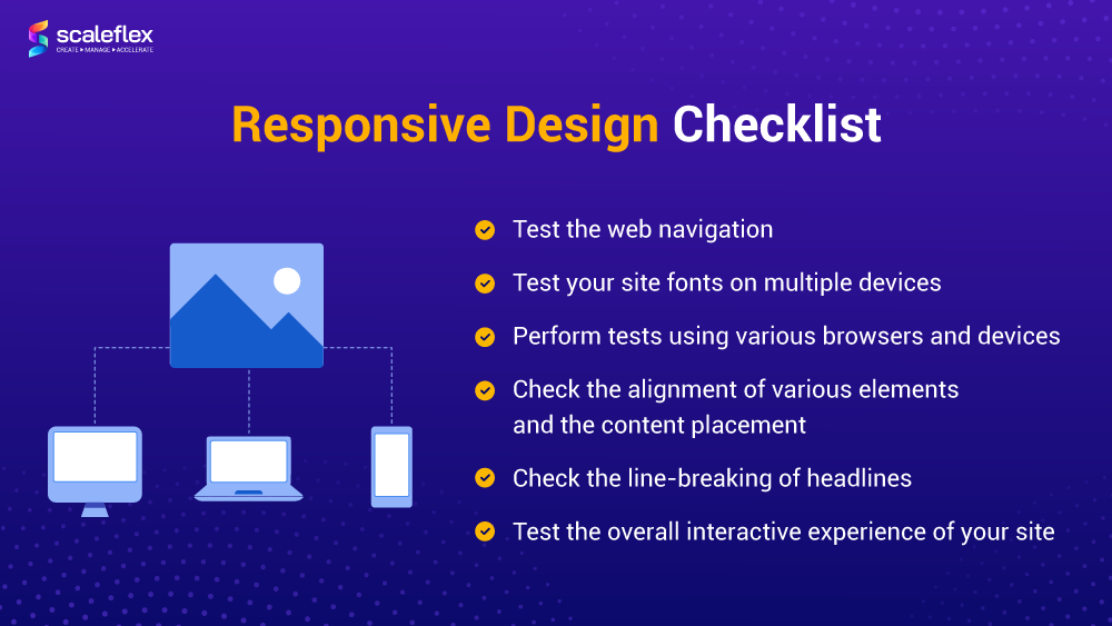
Here is an overall checklist for testing responsiveness:
✓ Test the website navigation – the navigation bar should change in response to the device change;
✓ Test your site fonts on multiple devices – this check is needed because not all fonts are supported universally;
✓ Perform tests using various browsers and devices – you can use web analytics data to select the most used ones on your site, and make sure everything works fine and smoothly in terms of responsiveness;
✓ Check the alignment of various elements and the content placement – this is especially important for smaller screen devices, as it is easier to notice when something is out of place;
✓ Check the headlines - especially those, which include long words; line-breaking rules might not be implemented correctly on all screen sizes or types;
✓ Test the overall interactive experience of your site, and test it from the end-user’s perspective.
In addition, there are also some good tools to use, including Responsinator, ScreenFly, Google Resizer, Google DevTools Device Mode, etc.
Benefits of Responsive Images
As we already established, responsiveness is essential because it is focused on delivering the optimal file size and the right image for the right screen. It also improves the overall user experience and page loading time. Needless to say, these factors help your website to score a better SEO (Search Engine Optimization) ranking.
To illustrate the benefits, let’s think of an example. A high-resolution image looks amazing on a 4K display but it won’t look as pleasing on a mobile device screen. The image would be reduced to fit the mobile display, and you would miss most of its beautiful, sharp details. However, if you view a version of the image that is simply scaled down for your mobile, the problem would not happen. This is what responsiveness means and why it is so beneficial for the user experience.
Drawbacks of Responsive Images
Despite being a powerful web design set of techniques, responsive images have their limitations a.k.a. drawbacks.
First of all, if you don’t have a dedicated developer or a web designer to do the image optimization for you, you may find it quite challenging. To add such images to your site, you should already be acquainted with the basics of HTML and how to add static images to a web page. That being said, you need some technical background.
Furthermore, under specific circumstances, responsive images may cause performance issues on high-resolution devices. Here’s an example of when this might happen:
- If an image with a full-bleed (edge-to-edge) layout is served in a responsive layout to all device widths;
- If the srcset list includes images of varying src options, from small to very large, for various devices, including desktop, tablet, mobile, large monitors and high-resolution laptops;
- If the sizes attribute is marked up to spec with natural breakpoints.
In these specific conditions, a high-resolution smartphone would download larger image files to address screen resolutions demands. This would negate the original intent of the RICG responsive images, which is lowering bandwidth on mobile devices upon viewing the images.
This could be further complicated by current design trends. As the srcset list attribute must include very large image sources to account for high-resolution screens, small devices with such screens will use the same sources, leading to wasted bandwidth and degraded performance, as explained by web developer Morten Rand-Hendriksen in a GitHub write-up.
How to Make Images Responsive?
So, how to make an image responsive? What are the options?
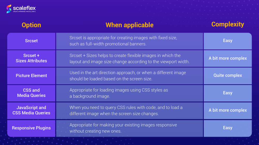
Using HTML: Srcset and Srcset + Sizes attributes
How to create the so-called responsive HTML image?
The srcset and sizes attributes on img or source elements enable you to define various image resources. These help a user agent to determine the most appropriate image source to display.
The srcset attribute alone helps to provide images that can be potentially served by the browser. The author should provide a comma-separated list of images, whereas the user agent determines which image to display according to the device’s specifics.
Upon listing the images, we as authors provide two pieces of information about each image:
- The path to the image file
- The pixel density or width of the image
Pixel density is defined by adding an x to the image density number:
<img src="example1.png"
     srcset="example2.png 2x, example3.png 3x, example4.png 4x">
Note that the image defined with the src attribute is estimated to be 1x. As for the image width, we should add a w to the pixel width number:
<img src="example1.png"
     srcset="example2.png 100w, example3.png 500w, example4.png 1000w">
Keep in mind that using the sizes attribute is only possible when using the width version of srcset attribute.
Using Picture Element
The picture element helps provide assets, adapted to the medium they are viewed on. Shortly put, this element enables us to define multiple assets to be utilized under various specified conditions. Assets can be defined at different viewport breakpoints or pixel ratios, which means that assets of the correct dimensions are served. This helps save a lot of bandwidth resources.
You can have a look at an example of the markup of the picture element:
<picture>
  <source srcset="small.jpg, small2x.jpg 2x"
      	media="(max-width: 639px)">
  <source srcset="medium.jpg, medium2x.jpg 2x"
      	media="(min-width: 640px) and (max-width: 1023px)">
  <source srcset="large.jpg, large2x.jpg 2x"
      	media="(min-width: 1024px)">
  <img src="my-image.jpg" alt="My image"
   	srcset="my-image2x.jpg 2x">
</picture>
CSS and Media Queries
How to create a responsive CSS image?
This part is about using CSS to make images responsive. The images you upload to your site have default width and height properties, but both can be changed with the help of CSS. To make them responsive, just add a new value to the width property, and the height will adjust itself automatically.
Note. Keep in mind that it is recommended to always use relative units for the width property, such as percentage, instead of absolute ones such as pixels. Here’s what we mean:
img {
  width: 500px;
}
As for media queries, also known as CSS breakpoints, they are literally points defined in the code. The content of your site responds to them and adjusts itself to the screen size to display the correct layout. If your media queries are in place, the site’s content will align itself with the screen size and display itself correctly.
Here is an example of an image that has a 50% width for any screen. To make it maximize to full size for any mobile device, you can implement media queries in the following way:
@media only screen and (max-width: 480px) {
img {
width: 100%;
}
}
Using JavaScript and CSS Media Queries
If you want to run a JavaScript code relying on CSS media queries, things get more complicated. This is where matchMedia comes in handy. It is a good approach to use JS and media queries together. However, note that it is not supported by all browsers.
What does matchMedia do? It enables developers to query CSS rules with code. It also gives the ability to add an event listener to the window, meaning that whenever the rule is applied (or whenever a corresponding media query would match), your code will be called. This is what Responsive JavaScript is.
Using Responsive Plugins
By using a plugin, it becomes possible to make your existing images responsive without creating new ones, in a very easy way. In fact, this is the fastest way to make images responsive in 2022. The most important feature is that the plugin will automate most of the tasks. Depending on your website type and your chosen CMS (Content Management System), there are plenty of choices.
A more wholesome approach is using an Image CDN, such as Cloudimage, which delivers compressed, pixel-perfect and responsive images. This plugin uses a unique approach for making images responsive. Default CSS/HTML doesn't allow setting parameters to follow the image container, whereas Cloudimage checks not the current screen width, but the image container itself.
Conclusion
Implementing responsive images will ensure a great user experience and performance on various devices. If you’re just entering the world of web development, you’d be pleased to discover the availability of tools to help you achieve responsive design. Modern HTML and CSS standards make it easier to create and use responsive images in elegant designs that look awesome on screens of all sizes.
Return to the Table of ContentsFAQs
What is a responsive image?
Shortly said, it is an image with a size that responds well to screen resolution changes. Responsive images are a small part of responsive web design, and their purpose is to make images work smoothly on various devices with different sizes and resolutions.
How can you make an image responsive?
There are several ways to make responsive images, including the implementation of HTML, picture elements, CSS and media queries, JavaScript, and responsive plugins. All methods are described in detail in the article above.
What is a responsive image gallery?
A responsive image gallery is a carousel slider with various features and options that can be customized according to your site’s needs.
How do I make images responsive on all devices?
One way to do it is by using CSS. When an image is uploaded to a website, it comes with default height and width parameters. You can change these with CSS to make them responsive.
How do I make all images responsive in HTML?
The srcset and sizes attributes on img or source elements help you to define various image resources. These help a user agent to determine the most appropriate image source to display.
Return to the Table of Contents

